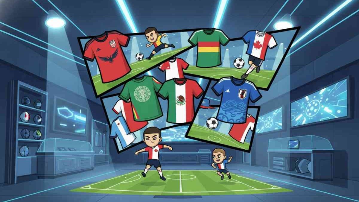
World Cup 2026 Kits: Every Team’s Jersey Ranked
Look, we have all been waiting for this moment. A World Cup on North American soil, 48 teams, and enough jerseys to fill several flight hangars. But let’s be honest—not every kit is a winner. Some designers clearly spent their entire budget on the lunch buffet instead of the drafting board, while others have created pieces of art that belong in the Louvre (or at least on your bedroom wall).
I’ve spent the last month practically living in these shirts. I’ve seen them under the stadium lights in Vancouver and in the scorching heat of Texas. What follows is the most objective, slightly biased, and completely honest ranking of the 2026 World Cup kits. We aren’t just looking at colors; we are looking at the “vibe,” the cultural heritage, and whether you can actually wear it to the pub without looking like a highlighter.
The Heavy Hitters: Top 10 Kits of 2026
So, who actually nailed it this year? The top tier is a mix of nostalgia and bold neon experiments that somehow worked. But before we get into the details, you might want to see if the teams wearing these beauties actually have a chance at the trophy. Take a peek at our World Cup 2026 Predictions to see if style equals substance this summer.
1. Mexico (Home) – Adidas
Adidas finally listened. After years of experimentation, they went back to a deep, forest green but added incredible sublimated Aztec jaguar patterns across the chest. But the real winner here is the return of the burgundy socks. It’s a perfect nod to the 1930-1950 era. It feels powerful, cultural, and incredibly sharp. Honestly, I’d wear this to my own wedding.
2. Nigeria (Away) – Nike
Nigeria doesn’t miss. Ever. This year, Nike used a “Digital Forest” theme. It’s a neon green and black mashup that looks like something out of a cyberpunk movie. Is it busy? Yes. Is it loud? Absolutely. But in the sea of boring templates, Nigeria stands alone. This kit will be sold out before the opening whistle at the World Cup 2026 main event.
3. Italy (Home) – Adidas
Classic Azzurri. Adidas used a “Marbleized” texture that mimics the Renaissance statues of Florence. It’s subtle—you can only really see it when the sunlight hits it right—but it adds a level of luxury that only Italy can pull off. The tricolor stripes on the shoulders are the icing on the cake.

4. USA (Home) – Nike
Nike took a risk here. Instead of the plain white tee look, they went for a “94 Throwback” feel. We’ve got a subtle denim-like texture in the weave and bold red and blue sleeve cuffs. It feels very “North American Summer,” and while some purists hate the collar, I think it’s the best host kit we’ve seen in decades.
5. Japan (Home) – Adidas
Japan always brings the heat. This year, the theme is “Origami Wind.” The blue jersey features white geometric shapes that seem to flutter as the players move. It’s technically impressive and visually stunning. Plus, the kit matches the aesthetic of the Official 2026 Match Ball perfectly.
6. France (Away) – Nike
Clean. Minimal. Deadly. It’s an all-white kit with very thin pinstripes in blue and red. It looks like a high-end designer shirt. But the real standout is the oversized cockerel crest in gold. It screams “We’re the favorites, and we know it.”
7. Argentina (Home) – Adidas
You don’t mess with perfection. The stripes are slightly wider this year, and the gold accents for the defending champions (well, former champions now?) are back. It feels heavy with history. Every time I see this shirt, I just think of 2022 nostalgia.
8. Portugal (Away) – Nike
Portugal’s away kit often gets ignored, but the 2026 version is a masterclass in “Azulejo” tile patterns. It’s a light blue print on an off-white base. It’s cultured, sophisticated, and looks incredible on the pitch. You can see how this kit performed during the early tournament stages by checking our Portugal Group Stage Results tracker.
9. South Korea (Home) – Nike
The “Tiger Stripe” is back, but this time it’s rendered in a heat-mapped neon pink and red. It’s aggressive and modern. It’s the kind of kit that scares defenders before the game even starts. Nike’s design team clearly had fun with this one.
10. Denmark (Home) – Hummel
Hummel always sticks to its roots. The 2026 kit features the classic chevrons, but the fabric has a 3D knit texture that creates a “faded” look. It’s a great example of how a small brand can compete with the giants through pure craftsmanship.
The “Just Okay” Tier: Solid but Safe
Not every kit can be a masterpiece. Some nations decided to play it safe, and honestly, I can’t blame them. When you’re playing in front of billions, you don’t always want to be the guy wearing a neon leopard print. These kits are fine. They’re professional. They’re… there.
- England (Home): It’s white. It has blue trim. It’s been the same since 1966, hasn’t it? The only saving grace is the retro font on the numbers.
- Germany (Away): They went with a purple-to-black gradient again. It worked in 2024, but it feels a bit “been there, done that” in 2026.
- Brazil (Home): It’s the yellow shirt. You can’t really go wrong, but the pale yellow they chose this year feels a bit washed out under the bright lights of Los Angeles.
- Canada (Home): A decent effort for the hosts. It features a maple leaf texture, but it feels a bit like a training top. We wanted something more “Great White North” and less “Corporate Office.”
But hey, a boring kit doesn’t mean a boring team. Sometimes the best football is played in the most basic shirts. It’s all about the performance when the whistle blows.

The Data Breakdown: Brands and Tech
If you’re a kit nerd like me, you don’t just care about the colors. You care about the “why” and the “how.” For 2026, the technology has taken a massive leap. We are seeing moisture-wicking tech that literally changes color when the player is overheating (it’s a bit gimmicky, but cool to see on TV).
| Brand | No. of Teams | Primary Tech | Overall Rank |
|---|---|---|---|
| Adidas | 16 | Heat.RDY 2.0 | A+ |
| Nike | 14 | Aura-Knit V3 | B+ |
| Puma | 8 | ULTRAWEAVE PRO | B- |
| Hummel | 3 | Eco-Tech Mesh | A- |
| Other | 7 | Various | C+ |
The Kits That Missed the Mark
And then, there are the ones that make you scratch your head. Look, design is subjective, but some of these choices are just baffling. I’m looking at you, Belgium. The “Chocolate” themed away kit? I get the cultural reference, but brown is a hard color to make look athletic on a football pitch. It looks more like a delivery driver uniform than a World Cup kit.
Spain also went a bit weird with their yellow away kit. It looks like a bowl of gazpacho spilled on a yellow tablecloth. It’s meant to represent “Spanish Summer Sunset,” but it mostly represents “I need a stain remover.”
So, why do these brands take such big risks? Simple: sales. A boring kit sells to the dads. A crazy kit sells to the fashion-forward Gen Z fans who wear jerseys to music festivals. But there’s a fine line between “fashion-forward” and “fashion-disaster.”
Jersey Trends We Noticed This Year:
- Oversized Crests: Brands are making the team logos bigger. It helps with visibility on social media and TV broadcasts.
- 90s Nostalgia: We are seeing a lot of baggy fits (well, slightly less tight) and 90s-style necklines.
- Sustainable Fabrics: Almost every kit in 2026 is made from 100% recycled ocean plastic. That’s a win for everyone.
- Sublimated Patterns: Plain solid colors are dead. Everything has a “hidden” pattern that only reveals itself up close.
How to Spot an Authentic 2026 Kit
With the hype at an all-time high, the market is flooded with fakes. If you’re dropping $150 on a “Player Version” shirt, you want to make sure it’s real. Here are three things I always check:
- The Heat-Pressed Crest: On authentic player versions, the crest isn’t stitched; it’s heat-pressed to save weight. If the edges are peeling or look messy, it’s a fake.
- The Side Vents: Nike and Adidas have specific laser-cut holes on the sides. On cheap knock-offs, these are usually just printed dots or simple mesh.
- The Serial Code: Check the small tag on the inside hip. You can actually Google this code, and it should bring up the specific jersey model. If it brings up a 2014 Brazil kit, you’ve been scammed.
FAQ – World Cup 2026 Kits
Which kit is the most expensive?
The “Authentic Player Version” kits from Nike and Adidas are retailing for roughly $170 USD. The “Fan Version,” which is a standard replica, usually goes for about $100 USD.
Why do some teams have different kits for the knockout rounds?
It’s a marketing tactic. Some big nations release a “special edition” jersey if they reach the quarter-finals to capitalize on the hype. It’s great for collectors, but tough on the wallet.
Is there a “Best Kit” award?
While FIFA doesn’t officially award a “Best Kit” trophy, various design magazines and fan polls usually crown a winner by the end of the tournament. Currently, Mexico and Nigeria are leading every poll.
What’s the best place to buy these?
Always go through official retailers or the brand’s direct website. Avoid third-party sites offering “80% off” deals—those are guaranteed fakes.
My Parting Thoughts on 2026 Style
At the end of the day, a kit is more than just a piece of polyester. It’s what we’ll remember when we look back at the photos of these games ten years from now. We’ll remember the goal scored in the “origami” shirt or the heartbreak felt in the “marble” jersey. This year, the brands really stepped up. They moved away from the boring, one-size-fits-all templates of 2022 and actually gave nations some identity back.
But whether you love the neon experiments or prefer the classic stripes, the 2026 World Cup is shaping up to be the best-dressed tournament in history. Just make sure you get your orders in early, because if the predictions are right, these kits won’t stay on the shelves for long.
- Stay ahead of the game with our detailed 2026 winner predictions.
- See how the kits look in action with the latest Portugal highlights.
- Check the latest news on Messi and Ronaldo’s final World Cup jerseys.